As a web developer, you may have come across a common design pattern where the footer of a website sticks to the bottom of the page, even when the content above it is not long enough to fill the entire viewport. This can be achieved using various techniques such as flexbox and grid layout, but in this tutorial, we will focus on how to make a footer stick to the bottom with Tailwind CSS using Flexbox.
Before we dive into the implementation, let’s first understand the problem at hand. When the content of a page is shorter than the viewport, the footer is not always positioned at the bottom of the page as expected. Instead, it appears somewhere in the middle of the page, leaving a lot of empty space below it.
Here is an example of a page with a non-sticky footer:
<body>
  <header>...</header>
  <main>...</main>
  <footer>...</footer>
</body>Making footer stick to bottom using Tailwind
To make the footer stick to the bottom, we need to do the following:
- Wrap the header, main, and footer elements in a container.
- Set the container to be at least as tall as the viewport.
- Position the footer at the bottom of the container.
Here is the updated HTML structure to make footer stick to bottom using Tailwind CSS:
<body>
<div class="container min-h-screen flex flex-col mx-auto">
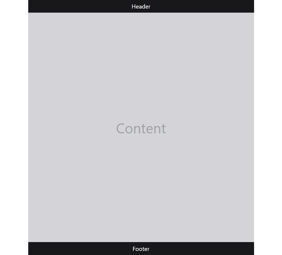
<header class="bg-zinc-900 text-center text-white py-2 text-xl">Header</header>
<main class="bg-zinc-300 text-center text-5xl flex-1 flex flex-wrap items-center justify-center text-zinc-400">Content</main>
<footer class="bg-zinc-900 text-center text-white py-2 text-xl shrink-0">Footer</footer>
</div>
</body>Here is a preview of the codes above.
Note
If you are already using another framework such as bootstrap, and don’t want to create class’es conflicts between the two frameworks then you can add a prefix to the tailwind classes.
Let’s understand the code above.
First, we set the container to be at least as tall as the viewport using the min-h-screen utility class. This ensures that the container takes up the entire viewport, even when the content is not long enough.
Next, we add the flex and flex-col utility classes to the container to make it a flex container and stack its children vertically (in a column).
Finally, we added flex-1 to the main tag to take up all remaining space. And all the other tags for styling the divs.