Hello Developers! I was working on a project where I wanted to add a button with a sideways triangle using CSS, so I searched for it and I don’t find any good results that explain it well. So here I’m writing about it!
Your CTA button with a sideways triangle is very important for your landing page. A call to action (CTA) button is an important element in web design that can have a significant impact on user engagement and conversion rates. A visually appealing and eye-catching CTA button can capture your website visitor’s attention and encourage them to take a specific action, such as making a purchase or completing a form. In this blog post, we’ll show you how to use CSS to create a stylish and interactive CTA button with a sideways triangle.
Table of Contents
HTML for a button with a sideways triangle
So let’s start with the HTML for the button with a sideways triangle.
<div class="cta-container">
  <button class="cta-button">Call to Action</button>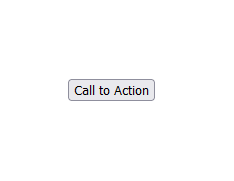
</div>This HTML code adds a container element with the class “cta-container” and a button element with the class “cta-button” to the page. The button element includes the text “Call to Action,” which can be changed to whatever you want.
Preview
This HTML code will look something like this:
CSS for a button with a sideways triangle
.cta-container {
  position: relative;
  display: inline-block;
}

.cta-container:before {
  content: "";
  position: absolute;
  top: 50%;
  right: -14px;
  transform: translateY(-50%) rotate(45deg);
  border-top: 28px solid #6747C7;
  border-right: 28px solid #6747C7;
  width: 0;
  height: 0;
}

.cta-button {
  width: 120px;
  height: 40px;
  background-color: #6747C7;
  color: white;
  border: none;
  position: relative;
  z-index: 1;
}
.cta-button:focus{
  outline: none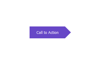
}Preview
The CSS code for the button with a sideways triangle will make the HTML static button look like the preview.
Now let’s take a closer look at the CSS code above for the button with a sideways triangle.
Firstly, we are targeting the “cta-container” class which is the parent element of our HTML for the button with a sideways triangle and we are adding the position property to “relative” so that when a child HTML element’s position property is set to “absolute” then it’s isolated within the parent HTML element. And then we are adding the display to “inline-block” so that when another button is added then it would be within the same row.
In the second selector, we are targeting the same “cta-container” HTML element but this time we are adding the :before pseudo-class to it. This is the part where we create the little triangle and then align it to the right of the button and it will result in the button with a sideways triangle. So let’s see what the CSS codes are doing. We are adding the “content” as empty strings (so that we don’t have any text inside the triangle). And then making the position property “absolute” and because we have our parent element’s position as relative, then this triangle won’t be outside of the parent element. And we are adding the top property to “50%” and the right property to “-14px”. You might need to change the right property according to the width of your button. And then we are bringing the sideways triangle to the vertical center with the “translateY(-50%)” value for the transform property. Now we need to rotate the triangle to make it look like an actual triangle with the “rotate(45deg)” value adding to the transform property as well. After that, we are adding the border on the top and the border on the right of the triangle that is making that sharp triangle look with the “28px solid #6747C7” value for the border-top and border-right properties. And then we are just making the width and height of the triangle to none because borders are doing all the tricks here.
And right after the sideways triangle CSS properties, we have done some styling for the button itself. But adding a width to it that is “120px” and a height of “40px“. And then we are adding a background color to our button with a sideways triangle, and make sure that the background color is the same color as the border color of the triangle which is “#6747C7“. We are also adding the text color using the color CSS property to be “white“, removing the default border of the button using the border CSS property to be set to none. And we are also making the button to be relative in position and with a z-index of 1 because we want the button to be at the top of the little triangle.
Lastly, we are targeting the button with the :focus pseudo-class added to it which means that apply these CSS when the button is focussed. And we are simply making the outline none so that we don’t have that annoying outline on the button. And with that, you have your HTML button with a sideways triangle with CSS.
In conclusion, the code in this blog post shows how to make a button with a sideways triangle using HTML and CSS. It is possible to create a wide range of shapes and designs using only HTML and CSS by combining absolute positioning, transforms, and border tricks. This allows you to add creative and one-of-a-kind elements to your website without the need for images or other external assets.
You might also be interested in How to make footer stick to bottom using tailwind CSS.